 Documentation
Documentation
Documentation
Thank you for purchasing Travel Engine theme! We’re glad that you found what you were looking for. It is our goal that you are always happy with what you bought from us, and We hope that you will be able to create an outstanding website with our theme easily.
Before proceeding with the theme installation, It is recommended that you follow the steps listed below. We have covered all kinds of necessary information, and provide you with all the guidelines and details that you will need to use Travel Engine theme. If you can’t find the answer you’re looking for, We encourage you to reach us through our Support portal. We'll be glad to help you out in your queries. Please Generate ticket through Support portal.
Follow the steps below to setup your site template:
Includes all assets and template files, used in theme
Includes all .css files, used in theme
Includes all images, used in .html files.
Includes font icon .css files, used in theme
Includes plugin's initialization file
Includes all slick slider .css and js files, used in theme
Includes all datepicker .css and js files, used in theme
Includes range slider .css and js files, used in theme for filtering the item through price
Includes all elements or shortcodes
Includes all .html files, used for customer panel
Includes all .html files, used for agent panel
Includes all .html files, used for super agent panel
Travel Engine follows a simple and easy to customize coding structure. Here is the sample for your reference:
<!doctype html>
    <html>
        <head>
            <!-- title -->
            <meta charset="utf-8">
            <!-- description -->
            <meta name="description" content="">
            <!-- keywords -->
            <meta name="keywords" content="">
            <!-- favicon -->
            <!-- style -->
        </head>
        <body>
            <!-- header start -->
                <!-- mobile nav start -->
                    <div class="mob-nav">
                        ...
                    </div>
                <!-- mobile nav end -->
                <header>
                    <!-- top bar start -->
                        <div class="top-bar">
                                ...
                        </div>
                    <!-- top bar end -->
                    <!-- navigation start  -->
                        <nav class="navbar navbar-default bootsnav navbar-expand-lg">
                                    ...
                        </nav>
                    <!-- navigation end -->
                </header>
            <!-- header end -->
            <!-- sections start -->
                <section>
                    ...
                </section>
            <!-- sections end -->
        <!-- footer start -->
            <footer>

            </footer>
        <!-- footer end -->
        <!-- javascript & css libraries -->
    </body>
</html>
The Logo Container can be found in the Header --> Nav Container - .navbar
<a class="navbar-brand" href="index.html">
    <img src="img/travel-engine-logo.png" alt="" />
</a>
Image Settings
Travel Engine download package does not contain images which are there in our online demo.
We are using placeholder images instead of real images. You will see the image code as mentioned below.
You can replace placeholder image url with your image url like img/yourimage.jpg
<img src="image path" alt="image alt text">
Favicon Settings
To change the favicon image of your site, you need to load a new ICO image in a site root or to point out a new address of the image.
<!-- favicon -->
<link rel="shortcut icon" href="img/favicon.png">
<link rel="apple-touch-icon" href="img/apple-touch-icon-57x57.png">
<link rel="apple-touch-icon" sizes="72x72" href="img/apple-touch-icon-72x72.png">
<link rel="apple-touch-icon" sizes="114x114" href="img/apple-touch-icon-114x114.png">
By default, Travel Engine uses the Google fonts. In case, If you want to change font to any other Google fonts. You can change the fonts from /css/style.css file in below lines.
/* Google font */
@import url('https://fonts.googleapis.com/css2?family=Roboto:ital,wght@0,100;0,300;0,400;0,500;0,700;0,900;1,100;1,300;1,400;1,500;1,700&display=swap');
@import url('https://fonts.googleapis.com/css2?family=Open+Sans:ital,wght@0,300;0,400;0,600;0,700;1,300;1,400;1,600&display=swap');
@import url('https://fonts.googleapis.com/css2?family=Poppins:ital,wght@0,100;0,200;0,300;0,400;0,500;0,600;0,700;0,800;1,100;1,200;1,300;1,400;1,500;1,600;1,700&display=swap');
To change the font, first go to Google fonts, choose your desired font and use the generated code.
If you have a need to use custom fonts, Remove above section completely and visit Self Hosted Fonts
If you want to setup right-to-left styling, You just need to link rtl-style.css at the end of <head> tag of each page. See example below:
<link rel="stylesheet" type="text/css" href="css/rtl-style.css" />
<!doctype html>
<html lang="ar"> <!-- set lang="ar" for RTL -->
    <head>
        <!-- title -->
        <meta charset="utf-8">
        <!-- description -->
        <meta name="description" content="">
        <!-- keywords -->
        <meta name="keywords" content="">
        <!-- favicon -->
        <!-- style -->

        <!-- RTL style -->
        <link rel="stylesheet" type="text/css" href="css/rtl-style.css" />
    </head>
    <body>
            ...
    </body>
</html>
Note
LTR are enabled by default. If you wish to enable the RTL styling you can simply add lang="ar" and css file rtl-style.css above code from all HTML files.
you will need to add custom CSS through a separate CSS file.
You just need to link custom.css at the end of <head> tag of each page. See example below:
<link rel="stylesheet" type="text/css" href="css/custom.css" />
You can change page mobile view navigation by changing below code to your new page.
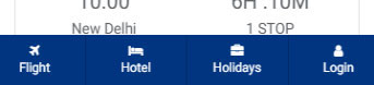
<!--Mobile view start-->
<div class="mob-nav">
    <div class="row">
        <div class="col-3">
            <a href="flight.html"> <i class="fa fa-plane"> </i> <span> Flight </span> </a>
        </div>
        <div class="col-3">
            <a href="hotel.html"> <i class="fa fa-bed"> </i> <span> Hotel </span> </a>
        </div>
        <div class="col-3">
            <a href="holidays.html"> <i class="fa fa-briefcase"> </i> <span> Holidays </span> </a>
        </div>
        <div class="col-3">
            <a href="login.html"> <i class="fa fa-user"> </i> <span> Login </span> </a>
        </div>
    </div>
</div>
<!--Mobile view end-->
Note Page Mobile view Nav are enabled by default. If you wish to disable the page Mobile view Nav you can simply delete above code from all HTML files.
You can choose between 6 Types of page titles while creating your pages. The list of page title options & its descriptions are provided below for your reference:
It includes page title with alligned left, sub title under page title and breadcrumb in right part. See below image and code for more inforamtion.
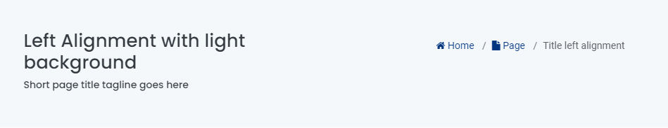
<!-- page title section start -->
<section class="site-title light-title">
    <div class="container">
        <div class="row">
            <div class="col-12 col-md-6 col-lg-6">
                <!-- page title start -->
                <h1> Left alignment with light background </h1>
                <!-- page title end -->
                <!-- sub title start -->
                <h6> Short page title tagline goes here </h6>
                <!-- sub title end -->
            </div>
            <div class="col-12 col-md-6 col-lg-6 text-sm-right text-md-right text-lg-right">
                <!-- breadcrumb start -->
                <nav aria-label="breadcrumb">
                    <ol class="breadcrumb">
                        <li class="breadcrumb-item active"> <a href="index.html"><i class="fa fa-home"></i> Home </a></li>
                        <li class="breadcrumb-item"> <a href="page-title.html"><i class="fa fa-file"></i> Page </a></li>
                        <li class="breadcrumb-item"> Title left alignment </li>
                    </ol>
                </nav>
                <!-- breadcrumb start -->
            </div>
        </div>
    </div>
</section>
<!-- page title section end -->
Note You can find Page Title demo or code in elements/page-title.html page for your reference..
It includes page title and sub title alligned center. See below image and code for more inforamtion.
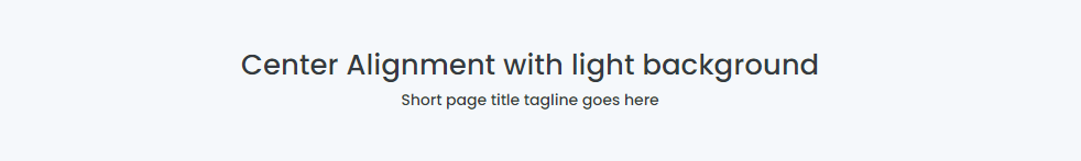
<!-- page title section start -->
<section class="site-title light-title text-center">
    <div class="container">
        <!-- page title start -->
        <h1> Center alignment with light background </h1>
        <!-- page title end -->
        <!-- sub title start -->
        <h6> Short page title tagline goes here </h6>
        <!-- sub title end -->
    </div>
</section>
<!-- page title section end -->
Note You can find Page Title demo or code in elements/page-title.html page for your reference..
It includes page title and sub title alligned center with dark background and light sub title. See below image and code for more inforamtion.
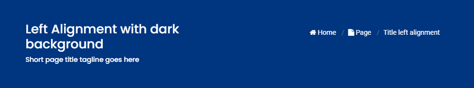
<!-- page title section start -->
<section class="site-title dark-title">
    <div class="container">
        <div class="row">
            <div class="col-12 col-md-6 col-lg-6">
                <!-- page title start -->
                <h1> Left alignment with dark background </h1>
                <!-- page title end -->
                <!-- sub title start -->
                <h6> Short page title tagline goes here </h6>
                <!-- sub title end -->
            </div>
            <div class="col-12 col-md-6 col-lg-6 text-sm-right text-md-right text-lg-right">
                <!-- breadcrumb  start -->
                <nav aria-label="breadcrumb">
                    <ol class="breadcrumb">
                        <li class="breadcrumb-item active"> <a href="index.html"><i class="fa fa-home"></i> Home </a></li>
                        <li class="breadcrumb-item"> <a href="page-title.html"><i class="fa fa-file"></i> Page </a></li>
                        <li class="breadcrumb-item"> Title left alignment </li>
                    </ol>
                </nav>
                <!-- breadcrumb start -->
            </div>
        </div>
    </div>
</section>
<!-- page title section end -->
Note You can find Page Title demo or code in elements/page-title.html page for your reference..
It includes page title and sub title alligned center with breadcrumbs at the bottm of page title. See below image and code for more inforamtion.
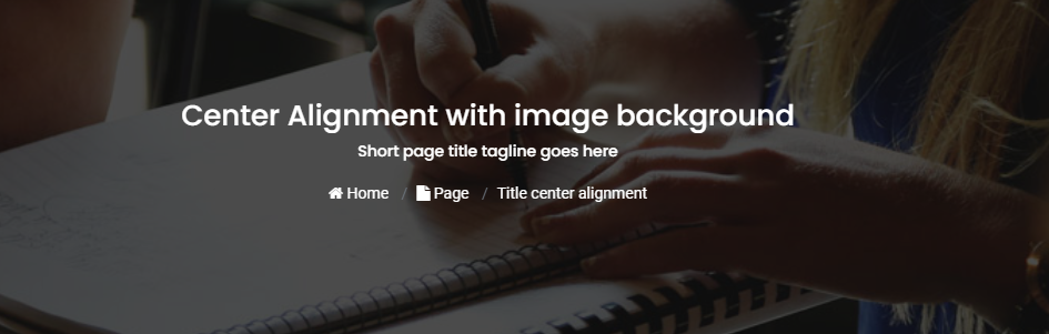
<!-- page title section start -->
<section class="site-title image-title overlay text-center" style=" background: url(../img/blog-banner.png);">
    <div class="container">
        <!-- page title start -->
        <h1> Center alignment with image background </h1>
        <!-- page title end -->
        <!-- sub title start -->
        <h6> Short page title tagline goes here </h6>
        <!-- sub title end -->

        <!-- breadcrumb start -->
        <nav aria-label="breadcrumb">
            <ol class="breadcrumb">
                <li class="breadcrumb-item active"> <a href="index.html"><i class="fa fa-home"></i> Home </a></li>
                <li class="breadcrumb-item"> <a href="page-title.html"><i class="fa fa-file"></i> Page </a></li>
                <li class="breadcrumb-item"> Title center alignment </li>
            </ol>
        </nav>
        <!-- breadcrumb start -->
    </div>
</section>
<!-- page title section end -->
Note You can find Page Title demo or code in elements/page-title.html page for your reference..
It includes page title and sub title alligned center with breadcrumbs at the bottm of page title. See below image and code for more inforamtion.
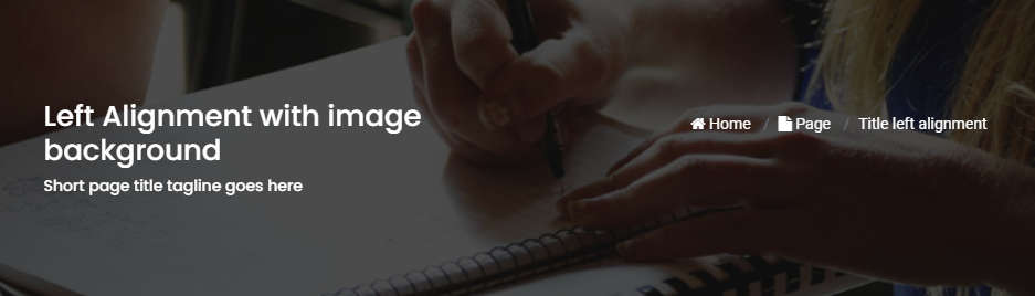
<!-- page title section start -->
<section class="site-title image-title overlay" style=" background: url(../img/blog-banner.png);">
    <div class="container">
        <div class="row">
            <div class="col-12 col-md-6 col-lg-6">
                <!-- page title start -->
                <h1> Left alignment with image background </h1>
                <!-- page title end -->
                <!-- sub title start -->
                <h6> Short page title tagline goes here </h6>
                <!-- sub title end -->
            </div>
            <div class="col-12 col-md-6 col-lg-6 text-sm-right text-md-right text-lg-right">
                <!-- breadcrumb start -->
                <nav aria-label="breadcrumb">
                    <ol class="breadcrumb">
                        <li class="breadcrumb-item active"> <a href="index.html"><i class="fa fa-home"></i> Home </a></li>
                        <li class="breadcrumb-item"> <a href="page-title.html"><i class="fa fa-file"></i> Page </a></li>
                        <li class="breadcrumb-item"> Title left alignment </li>
                    </ol>
                </nav>
                <!-- breadcrumb start -->
            </div>
        </div>
    </div>
</section>
<!-- page title section end -->
Note You can find Page Title demo or code in elements/page-title.html page for your reference..
You can choose between 3 Types of page layout while creating your page. The list of page layout options & its descriptions are provided below for your reference:
<!-- navigation start -->
<header>
    <div class="container-fluid">
        <nav class="navbar navbar-expand-lg navbar-light bg-white">
            ...
        </nav>
    </div>
</header>
<!--navigation end -->
<!-- page title start -->
<section class="banner-blog overlay" style=" background: url(../img/blog-banner.png) no-repeat; background-size: cover;">
    <div class="container-fluid">
    <h1> About Travel Engine </h1>
        ...
    </div>
</section>
<!-- page title end -->
<!-- page content start -->
<section>
    <div class="container-fluid">
        <div class="row">
            <!-- content start -->
            <div class="col-12">
                ...
            </div>
            <!-- content end -->
        </div>
    </div>
</section>
<!-- page content end-->
<!-- footer start -->
<footer>
    ...
</footer>
<!-- footer end-->
<!-- navigation start -->
<header>
    <div class="container-fluid">
        <nav class="navbar navbar-expand-lg navbar-light bg-white">
            ...
        </nav>
    </div>
</header>
<!--navigation end -->
<!-- page title start -->
<section class="banner-blog overlay" style=" background: url(../img/blog-banner.png) no-repeat; background-size: cover;">
    <div class="container-fluid">
    <h1> About Travel Engine </h1>
        ...
    </div>
</section>
<!-- page title end -->
<!-- page content start -->
<section>
    <div class="container-fluid">
        <div class="row">
            <!-- side bar start -->
            <aside class="col-md-3 col-lg-3">
                ...
            </aside>
            <!-- side bar end -->
            <!-- main section start -->
            <main class="col-md-9 col-lg-9">
                ...
            </main>
            <!-- main section end -->
        </div>
    </div>
</section>
<!-- page content end-->
<!-- footer start -->
<footer>
    ...
</footer>
<!-- footer end-->
<!-- navigation start -->
<header>
    <div class="container-fluid">
        <nav class="navbar navbar-expand-lg navbar-light bg-white">
            ...
        </nav>
    </div>
</header>
<!--navigation end -->
<!-- page title start -->
<section class="banner-blog overlay" style=" background: url(../img/blog-banner.png) no-repeat; background-size: cover;">
    <div class="container-fluid">
    <h1> About Travel Engine </h1>
        ...
    </div>
</section>
<!-- page title end -->
<!-- page content start -->
<section>
    <div class="container-fluid">
        <div class="row">
            <!-- main section start -->
            <main class="col-md-9 col-lg-9">
                ...
            </main>
            <!-- main section end -->
            <!-- side bar start -->
            <aside class="col-md-3 col-lg-3">
                ...
            </aside>
            <!-- side bar end -->
        </div>
    </div>
</section>
<!-- page content end-->
<!-- footer start -->
<footer>
    ...
</footer>
<!-- footer end-->
Note You can find code in blog.html page for your reference.
Basic grid layouts to get you familiar with building within the Bootstrap grid system.
we migrate entire theme in Bootstrap 4, so you can find detaild documentation on grid here:
https://getbootstrap.com/docs/4.3/layout/grid/
You can add this helper class to any element in your HTML code to set text color:
| Class name | Description |
|---|---|
.text-primary |
Main primary color text |
.text-white |
White color text |
.text-dark |
Dark color text |
You can also use bootstrap color classes.
<div class="sliderOne">
     <!--Item 01-->
	<div>
	    <div class="blog-design-five">
                <a href="#!">
                    <img src="img/your-image-01.jpg" alt="" / >
                </a>
                <div class="blog-design-five-text">
                    <a href="#!" class="blog-design-five-category">UI/UX Design </a>
                    <a href="#!">
                        <h2> Key benefits of my portfolio update</h2>
                    </a>
                    <div class="blog-design-five-author">
                        <span> by <a href="#!"> Mohammad</a> | 25 November 2020</span>
                    </div>
                    <p> Lorem ipsum dolor sit amet consectetur adipiscing elit lacus, nullam vehicula ut diam faucibus vitae. </p>
                </div>
	    </div>
    </div>

     <!--Item 02-->
	<div>
	    <div class="blog-design-five">
                <a href="#!">
                    <img src="img/your-image-02.jpg" alt="" / >
                </a>
                <div class="blog-design-five-text">
                    <a href="#!" class="blog-design-five-category">UI/UX Design </a>
                    <a href="#!">
                        <h2> Key benefits of my portfolio update</h2>
                    </a>
                    <div class="blog-design-five-author">
                        <span> by <a href="#!"> Mohammad</a> | 25 November 2020</span>
                    </div>
                    <p> Lorem ipsum dolor sit amet consectetur adipiscing elit lacus, nullam vehicula ut diam faucibus vitae. </p>
                </div>
	    </div>
    </div>

     <!--Item 03-->
	<div>
	    <div class="blog-design-five">
                <a href="#!">
                    <img src="img/your-image-03.jpg" alt="" / >
                </a>
                <div class="blog-design-five-text">
                    <a href="#!" class="blog-design-five-category">UI/UX Design </a>
                    <a href="#!">
                        <h2> Key benefits of my portfolio update</h2>
                    </a>
                    <div class="blog-design-five-author">
                        <span> by <a href="#!"> Mohammad</a> | 25 November 2020</span>
                    </div>
                    <p> Lorem ipsum dolor sit amet consectetur adipiscing elit lacus, nullam vehicula ut diam faucibus vitae. </p>
                </div>
	    </div>
    </div>

     <!--Item 04-->
	<div>
	    <div class="blog-design-five">
                <a href="#!">
                    <img src="img/your-image-04.jpg" alt="" / >
                </a>
                <div class="blog-design-five-text">
                    <a href="#!" class="blog-design-five-category">UI/UX Design </a>
                    <a href="#!">
                        <h2> Key benefits of my portfolio update</h2>
                    </a>
                    <div class="blog-design-five-author">
                        <span> by <a href="#!"> Mohammad</a> | 25 November 2020</span>
                    </div>
                    <p> Lorem ipsum dolor sit amet consectetur adipiscing elit lacus, nullam vehicula ut diam faucibus vitae. </p>
                </div>
	    </div>
	</div>
</div>
$(document).on('ready', function() {
    $('.sliderOne').slick({
        dots: false, // You can control the bullets to show or hide
        infinite: false,
        speed: 300, // You can control the speed of slides
        slidesToShow: 3, // You can control the no. of items to display on the screen
        slidesToScroll: 1, // You can control the no. of items to display on the scroll
        responsive: [ // this code is used to control the responsiveness of silde only
            {
            breakpoint: 1024,
            settings: {
                slidesToShow: 2,
                slidesToScroll: 3,
                infinite: true,
                dots: true
            }
            },
            {
            breakpoint: 767,
            settings: {
                slidesToShow: 1,
                slidesToScroll: 2
            }
            },
            {
            breakpoint: 480,
            settings: {
                slidesToShow: 1,
                slidesToScroll: 1
            }
            }
        ]
});
Note You can find slick slider - all code available in elements/carousels.html page and above is the code for your reference.
<div id="carouselExampleCaptions" class="carousel slide sliderSix" data-ride="carousel">
    <ol class="carousel-indicators">
        <li data-target="#carouselExampleCaptions" data-slide-to="0" class="active"> </li>
        <li data-target="#carouselExampleCaptions" data-slide-to="1"> </li>
        <li data-target="#carouselExampleCaptions" data-slide-to="2"> </li>
    </ol>
    <div class="carousel-inner">
        <div class="carousel-item active">
            <img src="img/your-image-01.jpg" class="d-block w-100" alt="">
            <div class="carousel-caption d-none d-md-block">
                <h5> First slide label </h5>
                <p> Nulla vitae elit libero, a pharetra augue mollis interdum. </p>
            </div>
        </div>

        <div class="carousel-item">
            <img src="img/your-image-02.jpg" class="d-block w-100" alt="">
            <div class="carousel-caption d-none d-md-block">
                <h5> First slide label </h5>
                <p> Nulla vitae elit libero, a pharetra augue mollis interdum. </p>
            </div>
        </div>
    </div>
    <a class="carousel-control-prev" href="#carouselExampleCaptions" role="button" data-slide="prev">
        <span class="carousel-control-prev-icon" aria-hidden="true"> </span>
        <span class="sr-only"> Previous </span>
    </a>
    <a class="carousel-control-next" href="#carouselExampleCaptions" role="button" data-slide="next">
        <span class="carousel-control-next-icon" aria-hidden="true"> </span>
        <span class="sr-only"> Next </span>
    </a>
</div>
Note You can also use Bootstrap carousel.
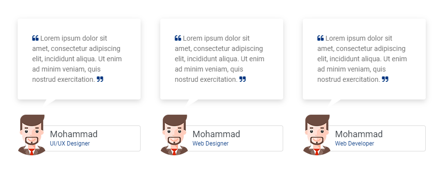
Beautiful testimonial layouts to display your content with attractive look. See below image and code for more information.
<div class="container">
    <div class="row">
         <!--Item 01-->
        <div class="col-12 col-md-4">
            <div class="testi-con">
                <p>
                    <i class="fa fa-quote-left"> </i>
                    Lorem ipsum dolor sit amet, consectetur adipiscing elit,
                    incididunt aliqua. Ut enim ad minim veniam,
                    quis nostrud exercitation.
                    <i class="fa fa-quote-right"> </i>
                </p>
            </div>
            <div class="triangle-down"> </div>
            <div class="testi-con-name">
                <img src="img/your-imag-01.png" alt="">
                Mohammad
                <p> Web Designer </p>
            </div>
        </div>

         <!--Item 02-->
        <div class="col-12 col-md-4">
            <div class="testi-con">
                <p>
                    <i class="fa fa-quote-left"> </i>
                    Lorem ipsum dolor sit amet, consectetur adipiscing elit,
                    incididunt aliqua. Ut enim ad minim veniam,
                    quis nostrud exercitation.
                    <i class="fa fa-quote-right"> </i>
                </p>
            </div>
            <div class="triangle-down"> </div>
            <div class="testi-con-name">
                <img src="img/your-imag-02.png" alt="">
                Mohammad
                <p> Web Designer </p>
            </div>
        </div>

         <!--Item 03-->
        <div class="col-12 col-md-4">
            <div class="testi-con">
                <p>
                    <i class="fa fa-quote-left"> </i>
                    Lorem ipsum dolor sit amet, consectetur adipiscing elit,
                    incididunt aliqua. Ut enim ad minim veniam,
                    quis nostrud exercitation.
                    <i class="fa fa-quote-right"> </i>
                </p>
            </div>
            <div class="triangle-down"> </div>
            <div class="testi-con-name">
                <img src="img/your-imag-03.png" alt="">
                Mohammad
                <p> Web Designer </p>
            </div>
        </div>
    </div>
</div>
Note For demo, You can please check this in elements/testimonials.html.
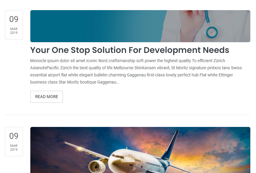
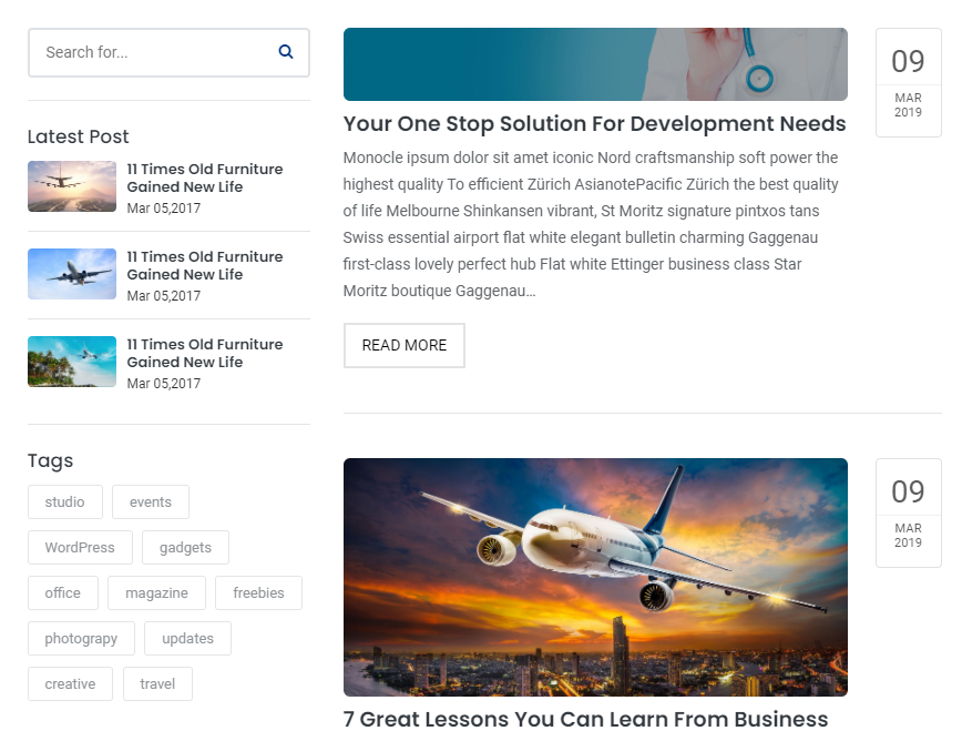
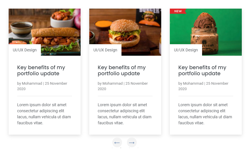
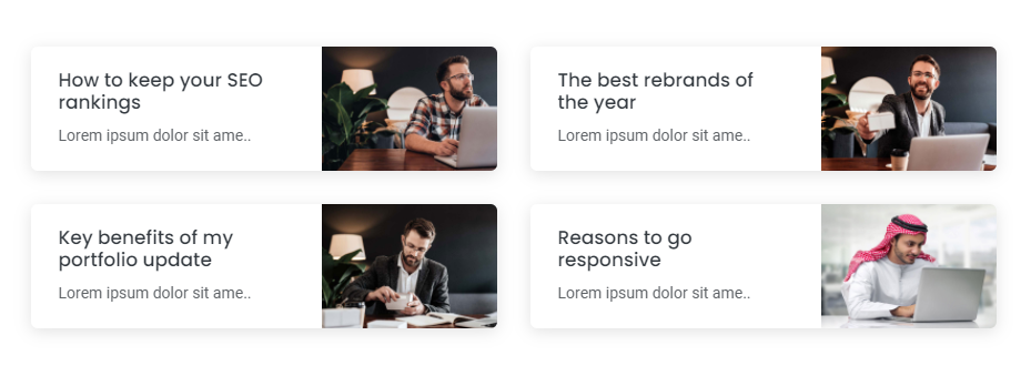
Beautiful blog post layouts to display your content with attractive look. See below image and code for more information.
<div class="container">
    <div class="row">
        <!--Blog item 01-->
        <div class="col-12 col-md-6 col-lg-6">
            <div class="blog-design-one-item">
                <div class="row">
                    <div class="col-12 col-sm-7 col-md-12 col-lg-7">
                        <div class="blog-design-one-text">
                            <a href="#!">
                                <h2>
                                    How to keep your SEO rankings
                                </h2>
                            </a>
                            <p> Lorem ipsum dolor sit amet consectetur, adipiscing elit arcu urna. </p>
                        </div>
                    </div>
                    <div class="col-12 col-sm-5 col-md-12 col-lg-5">
                        <a href="#!">
                            <img src="img/your-image-01.jpg" alt="" />
                        </a>
                    </div>
                </div>
            </div>
        </div>

        <!--Blog item 02-->
        <div class="col-12 col-md-6 col-lg-6">
            <div class="blog-design-one-item">
                <div class="row">
                    <div class="col-12 col-sm-7 col-md-12 col-lg-7">
                        <div class="blog-design-one-text">
                            <a href="#!">
                                <h2>
                                    How to keep your SEO rankings
                                </h2>
                            </a>
                            <p> Lorem ipsum dolor sit amet consectetur, adipiscing elit arcu urna. </p>
                        </div>
                    </div>
                    <div class="col-12 col-sm-5 col-md-12 col-lg-5">
                        <a href="#!">
                            <img src="img/your-image-02.jpg" alt="" />
                        </a>
                    </div>
                </div>
            </div>
        </div>

        <!--Blog item 03-->
        <div class="col-12 col-md-6 col-lg-6">
            <div class="blog-design-one-item">
                <div class="row">
                    <div class="col-12 col-sm-7 col-md-12 col-lg-7">
                        <div class="blog-design-one-text">
                            <a href="#!">
                                <h2>
                                    How to keep your SEO rankings
                                </h2>
                            </a>
                            <p> Lorem ipsum dolor sit amet consectetur, adipiscing elit arcu urna. </p>
                        </div>
                    </div>
                    <div class="col-12 col-sm-5 col-md-12 col-lg-5">
                        <a href="#!">
                            <img src="img/your-image-03.jpg" alt="" />
                        </a>
                    </div>
                </div>
            </div>
        </div>
    </div>
</div>
Note For demo, You can please check this in elements/blog.html.
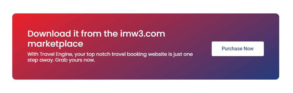
Beautiful call to action layouts to display your content with attractive look. See below image and code for more information.
<div class="cal-to-action">
    <div class="row">
        <div class="col-12 col-md-8 col-lg-9">
            <h3> Download it from the imw3.com marketplace </h3>
            <h6>
               With Travel Engine, your top notch travel booking website
                is just one step away. Grab yours now.
            </h6>
        </div>
        <div class="col-12 col-md-4 col-lg-3 dflex">
            <a href="#!"> Purchase Now </a>
        </div>
     </div>
</div>
Note For demo, You can please check this in elements/call-to-action.html.
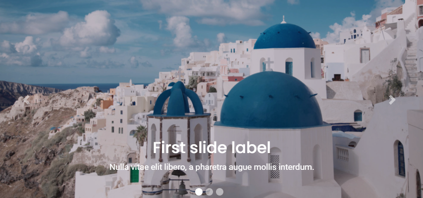
Beautiful sliders layouts to display your content with attractive look. See below image and code for more information.
<div class="sliderOne">
     <!--Item 01-->
	<div>
	    <div class="blog-design-five">
                <a href="#!">
                    <img src="img/your-image-01.jpg" alt="" / >
                </a>
                <div class="blog-design-five-text">
                    <a href="#!" class="blog-design-five-category">UI/UX Design </a>
                    <a href="#!">
                        <h2> Key benefits of my portfolio update</h2>
                    </a>
                    <div class="blog-design-five-author">
                        <span> by <a href="#!"> Mohammad</a> | 25 November 2020</span>
                    </div>
                    <p> Lorem ipsum dolor sit amet consectetur adipiscing elit lacus, nullam vehicula ut diam faucibus vitae. </p>
                </div>
	    </div>
    </div>

     <!--Item 02-->
	<div>
	    <div class="blog-design-five">
                <a href="#!">
                    <img src="img/your-image-02.jpg" alt="" / >
                </a>
                <div class="blog-design-five-text">
                    <a href="#!" class="blog-design-five-category">UI/UX Design </a>
                    <a href="#!">
                        <h2> Key benefits of my portfolio update</h2>
                    </a>
                    <div class="blog-design-five-author">
                        <span> by <a href="#!"> Mohammad</a> | 25 November 2020</span>
                    </div>
                    <p> Lorem ipsum dolor sit amet consectetur adipiscing elit lacus, nullam vehicula ut diam faucibus vitae. </p>
                </div>
	    </div>
    </div>

     <!--Item 03-->
	<div>
	    <div class="blog-design-five">
                <a href="#!">
                    <img src="img/your-image-03.jpg" alt="" / >
                </a>
                <div class="blog-design-five-text">
                    <a href="#!" class="blog-design-five-category">UI/UX Design </a>
                    <a href="#!">
                        <h2> Key benefits of my portfolio update</h2>
                    </a>
                    <div class="blog-design-five-author">
                        <span> by <a href="#!"> Mohammad</a> | 25 November 2020</span>
                    </div>
                    <p> Lorem ipsum dolor sit amet consectetur adipiscing elit lacus, nullam vehicula ut diam faucibus vitae. </p>
                </div>
	    </div>
    </div>

     <!--Item 04-->
	<div>
	    <div class="blog-design-five">
                <a href="#!">
                    <img src="img/your-image-04.jpg" alt="" / >
                </a>
                <div class="blog-design-five-text">
                    <a href="#!" class="blog-design-five-category">UI/UX Design </a>
                    <a href="#!">
                        <h2> Key benefits of my portfolio update</h2>
                    </a>
                    <div class="blog-design-five-author">
                        <span> by <a href="#!"> Mohammad</a> | 25 November 2020</span>
                    </div>
                    <p> Lorem ipsum dolor sit amet consectetur adipiscing elit lacus, nullam vehicula ut diam faucibus vitae. </p>
                </div>
	    </div>
	</div>
</div>
$(document).on('ready', function() {
    $('.sliderOne').slick({
        dots: false, // You can control the bullets to show or hide
        infinite: false,
        speed: 300, // You can control the speed of slides
        slidesToShow: 3, // You can control the no. of items to display on the screen
        slidesToScroll: 1, // You can control the no. of items to display on the scroll
        responsive: [ // this code is used to control the responsiveness of silde only
            {
            breakpoint: 1024,
            settings: {
                slidesToShow: 2,
                slidesToScroll: 3,
                infinite: true,
                dots: true
            }
            },
            {
            breakpoint: 767,
            settings: {
                slidesToShow: 1,
                slidesToScroll: 2
            }
            },
            {
            breakpoint: 480,
            settings: {
                slidesToShow: 1,
                slidesToScroll: 1
            }
            }
        ]
});
Note For demo, You can please check this in elements/carousels.html.
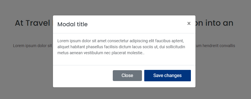
Beautiful modals layouts to display your content with attractive look. See below image and code for more information.
<!--modal button-->
<a data-toggle="modal" href="#defaultModal"> Launch demo modal </a>

<!--modal start-->
<div class="modal fade" id="defaultModal" tabindex="-1" aria-labelledby="exampleModalLabel" aria-hidden="true">
    <div class="modal-dialog">
        <div class="modal-content">
            <div class="modal-header">
                <h5 class="modal-title" id="exampleModalLabel"> Modal title </h5>
                <button type="button" class="close" data-dismiss="modal" aria-label="Close">
                    <span aria-hidden="true"> × </span>
                </button>
            </div>
            <div class="modal-body">
                <p>
                    Lorem ipsum dolor sit amet consectetur adipiscing elit faucibus aptent.
                </p>
            </div>
            <div class="modal-footer">
                <button type="button" class="btn btn-secondary" data-dismiss="modal"> Close </button>
                <button type="button" class="btn btn btn-desin-one"> Save changes </button>
            </div>
        </div>
    </div>
</div>
<!--modal end-->
Note For demo, You can please check this in elements/modal.html.
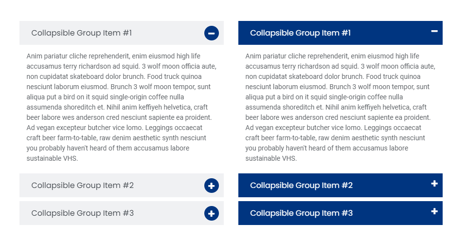
Beautiful accordion layouts to display your content with attractive look. See below image and code for more information.
<div class="panel-group accordion-design-three" id="accordionThree" role="tablist" aria-multiselectable="true">
    <!--items 01-->
    <div class="panel panel-default">
        <div class="panel-heading">
            <h4 class="panel-title">
                <a data-toggle="collapse" href="#collapse1" aria-expanded="true">
                        Collapsible Group Item #1

                    <i class="fa fa-plus" style="display: none"> </i>
                    <i class="fa fa-minus"> </i>
                </a>
            </h4>
        </div>
        <div id="collapse1" class="panel-collapse collapse show" data-parent="#accordionThree">
            <div class="panel-body">
                Anim pariatur cliche reprehenderit, enim eiusmod high life
                accusamus terry richardson ad squid..
            </div>
        </div>
    </div>

    <!--items 02-->
    <div class="panel panel-default">
        <div class="panel-heading">
            <h4 class="panel-title">
                <a data-toggle="collapse" href="#collapse2" aria-expanded="true">
                        Collapsible Group Item #1

                    <i class="fa fa-plus"> </i>
                    <i class="fa fa-minus" style="display: none"> </i>
                </a>
            </h4>
        </div>
        <div id="collapse2" class="panel-collapse collapse" data-parent="#accordionThree">
            <div class="panel-body">
                Anim pariatur cliche reprehenderit, enim eiusmod high life
                accusamus terry richardson ad squid..
            </div>
        </div>
    </div>

    <!--items 03-->
    <div class="panel panel-default">
        <div class="panel-heading">
            <h4 class="panel-title">
                <a data-toggle="collapse" href="#collapse3" aria-expanded="true">
                        Collapsible Group Item #1

                    <i class="fa fa-plus"> </i>
                    <i class="fa fa-minus" style="display: none"> </i>
                </a>
            </h4>
        </div>
        <div id="collapse3" class="panel-collapse collapse" data-parent="#accordionThree">
            <div class="panel-body">
                Anim pariatur cliche reprehenderit, enim eiusmod high life
                accusamus terry richardson ad squid..
            </div>
        </div>
    </div>
</div>
$('.panel-collapse').on('show.bs.collapse', function () {
    $(this).parent('.panel').find('.fa-minus').show();
    $(this).parent('.panel').find('.fa-plus').hide();
})
$('.panel-collapse').on('hide.bs.collapse', function () {
    $(this).parent('.panel').find('.fa-minus').hide();
    $(this).parent('.panel').find('.fa-plus').show();
})
Note For demo, You can please check this in elements/accordions.html.
Beautiful tab layouts to display your content with attractive look. See below image and code for more information.
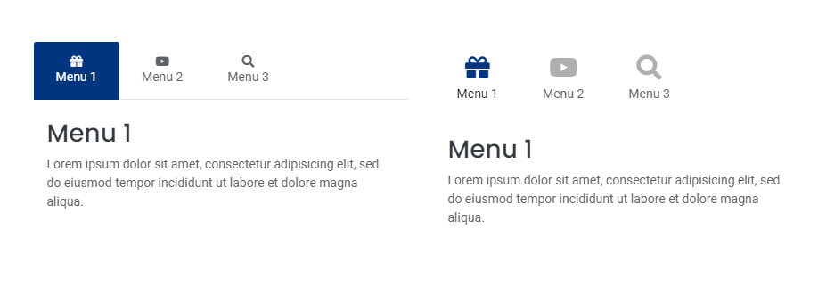
<div class="tab-design-five">
    <ul class="nav nav-tabs">
        <li class="nav-item">
            <a class="nav-link active" data-toggle="tab" href="#menu1"> <i class="fas fa-gift"> </i> Menu 1</a>
        </li>
        <li class="nav-item">
            <a class="nav-link" data-toggle="tab" href="#menu2"> <i class="fas fa-youtube"> </i> Menu 2</a>
        </li>
        <li class="nav-item">
            <a class="nav-link" data-toggle="tab" href="#menu3"> <i class="fas fa-search"> </i> Menu 3</a>
        </li>
    </ul>

    <!--tab panes-->
    <div class="tab-content">
        <div id="menu1" class="container tab-pane active">
            <h3> Menu 1 </h3>
            <p> Lorem ipsum dolor sit amet, consectetur adipisicing elit.. </p>
        </div>
        <div id="menu2" class="container tab-pane">
            <h3> Menu 1 </h3>
            <p> Lorem ipsum dolor sit amet, consectetur adipisicing elit.. </p>
        </div>
        <div id="menu3" class="container tab-pane">
            <h3> Menu 1 </h3>
            <p> Lorem ipsum dolor sit amet, consectetur adipisicing elit.. </p>
        </div>
    </div>
</div>
Note For demo, You can please check this in elements/tab.html.
Beautiful buttons to display your content with attractive look. See below image and code for more information.
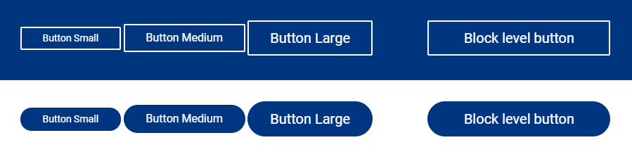
<a class="btn btn-sm btn-desin-four" href="#"> Button Small </a>
<a class="btn btn-desin-four" href="#"> Button Medium </a>
<a class="btn btn-lg btn-desin-four" href="#"> Button Large </a>
<a class="btn btn-lg btn-block btn-desin-four" href="#"> Block level button (100%) </a>

<a class="btn btn-sm btn-desin-five" href="#"> Button Small </a>
<a class="btn btn-desin-five" href="#"> Button Medium </a>
<a class="btn btn-lg btn-desin-five" href="#"> Button Large </a>
<a class="btn btn-lg btn-block btn-desin-five" href="#"> Block level button (100%) </a>
Note For demo, You can please check this in elements/button.html.
We would really love to take this opportunity to appreciate guys whose items were helpful to us to make travel Engine a really beautiful theme for our awesome users:
We've tried to make this documentation as easy and understandable as possible. However, in case of any difficulties with the theme, you can contact our technical support department with any suggestions regarding documentation and theme improvement.
Your read it entirely. Thanks!